Using the term “Menu Bar” should be a dead giveaway that this post is Mac-oriented.
I don’t want this to appear to be a whiny complaint, so I’m going to try to make it “constructive criticism” mixed with a call for ideas.
First, a brief history: After Apple introduced Mac OS X (“ten,” not “X” and now known as macOS), a major upgrade from the “Classic” Mac OS9, many new features began finding their way into the operating system. One of those features is officially called “Menu Extras.” According to Apple’s Human Interface Guidelines, the left side of a Mac’s menu is occupied by “traditional” icons (Apple, File, Edit, View, etc.) and the right side is where these menu extras go. Apple has its own set, but developers have been busy at work.

Looking through the MacUpdate web site, where I check every day for new and updated Mac software, it’s become more and more obvious that a lot of utility programs present themself to the user via a menu extra — usually an icon the sits in the menu bar.
I confess, I like the handy availability of these items. I like seeing the time, weather, memory usage, network connectivity and a variety of “quick-look” items I would otherwise have to open an app or utility to view. I also like the ability, no matter what I’m doing, to click and view my calendar, do an Internet search, check my clipboard items, configure a Bluetooth device, activate AirPlay, and a number of common activities without having to put aside work I’m doing.
The problem is — and I’ll admit to being part of it — is that my menu bar is getting crowded. I purchased a very helpful utility called BarTender 3, that lets me toggle the visibility of my choice, but even that only masks the issue. At this writing, I have 15 visible and 16 “hidden” items. That’s 31 items that have taken roost in my menu bar!
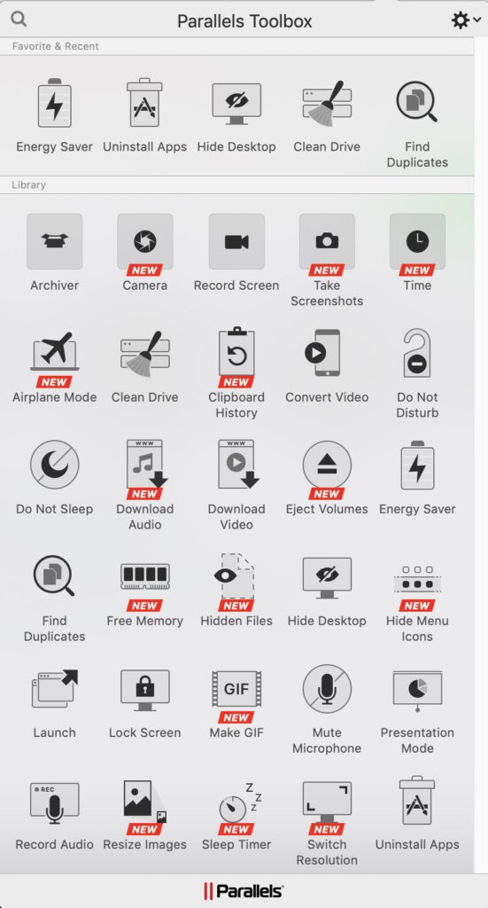
Now, I wonder. My creative mind isn’t what I’m known for, and it certainly isn’t paying the bills, but here’s a suggestion for any developers who might be reading this and looking for a new project: How about a single menu extra that when clicked, reveals all the others, and lets one click on a selected item? Parallels Toolbox paves the way for this, but it only offers the tools Parallels includes.

There are a number of useful utilities included, and I may begin replacing my single-purpose utilities with it. A new feature, shown in the image above, is “Hide Menu Icons.” Parallels Toolbox has the ability to identity an action I’m taking and can suggest using one of its features. For example, when I am giving a training, I use a Mac to display my presentation on a large screen TV, and Parallels Toolbox automatically offers to use Presentation Mode (muting alerts, popups, etc.).
In a way, I’m currently playing a juggling act using Bartender. Its own menu extra is used to toggle between “visible” and “hidden.” It has some other options I won’t go into here, but it’s one of those programs I feel is worth every penny I spent on it. Another one is TotalSpaces2. But that’s another topic, for another day.
